Tattooing on Darker Skin Tones: Contrast Strategy, Color Theory, and Healing Myths
Published October 2, 2026 · by Adora
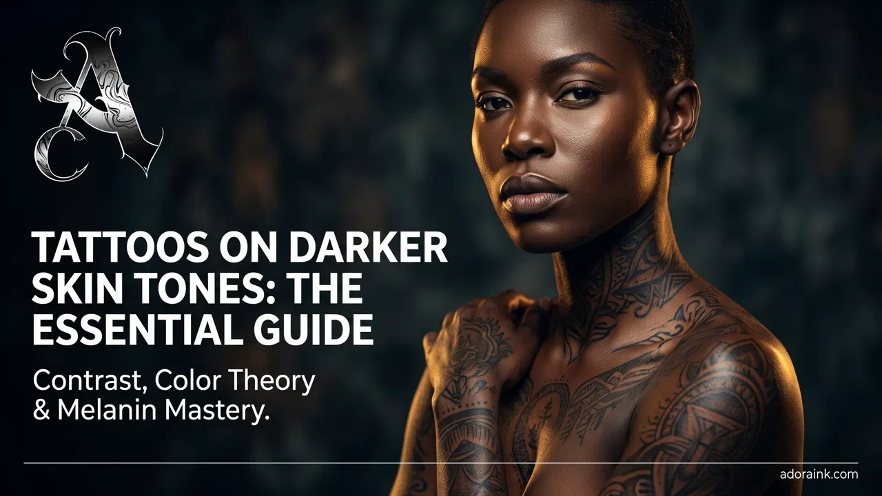
Darker skin does not limit good tattooing The idea that dark skin cannot hold detail or color is a myth. Tattoo pigment sits beneath the epidermis and is viewed through the client's natural melanin, so every design needs a considered relationship between skin tone, value, spacing, and saturation.…
Darker skin does not limit good tattooing
The idea that dark skin cannot hold detail or color is a myth. Tattoo pigment sits beneath the epidermis and is viewed through the client's natural melanin, so every design needs a considered relationship between skin tone, value, spacing, and saturation. At Adora Ink in Fuenlabrada, Madrid, we design for the individual rather than applying one formula to a broad category of complexions.
Contrast matters more than chasing a list of supposedly approved colors. Strong silhouettes, intentional negative space, readable value groups, and enough scale help a tattoo remain clear. This benefits fine-line work, black-and-grey tattoos, realism, and every other style. Fine detail is possible, but lines packed too closely can merge over time on any skin.
Color theory, not guesswork
Fresh ink appears through redness, swelling, ointment, and reflected studio light. The settled result is the relevant one. Warm, saturated hues often read strongly on deeper complexions, while lighter or muted colors may appear subtler. Yet undertone, body area, previous sun exposure, and neighboring values matter as much as a color name. A healed portfolio is therefore more useful than a universal chart.
A small color swatch can be useful when a client wants a complex palette and is uncertain how selected pigments will settle. It is not mandatory and cannot perfectly predict a full composition, but it can inform the final plan after healing. We use documented, EU-compliant products, informed by the REACH framework, from professional suppliers such as World Famous Ink.
The aim is not to make skin behave like white paper; it is to create a tattoo whose contrast works beautifully with that skin.
Which styles work best?
There is no single best style. High-impact blackwork, bold tribal designs, and clear old-school tattoos naturally prioritize silhouette. Neo-traditional work combines readable lines and rich shapes, while new-school tattooing uses exaggerated proportions and contrast. Large Japanese compositions organize backgrounds, skin breaks, and focal subjects across the body.
Subtle approaches are equally possible with planning. Chicano tattooing can build luminous portraits with black-and-grey values. Watercolor tattoos need anchors and sufficient value separation, and color tattoos benefit from deliberate palette testing. The style should match the idea, placement, scale, and artist's demonstrated healed experience—not a myth about complexion.
Healing myths and real risks
Darker skin does not automatically scar or form keloids after tattooing. Keloid tendency is individual and can run in families; anyone with a history of raised scars should disclose it and seek medical advice when appropriate. Overworking skin raises trauma for every complexion. Controlled depth, suitable machines such as professional systems from FK Irons, and disciplined technique matter.
Redness can be less visually obvious on deeper skin, so artists and clients also watch for heat, increasing pain, swelling, discharge, or symptoms that worsen. Follow our aftercare guide and contact a healthcare professional for possible infection or severe reaction. The hygiene guide, equipment guide, and needle article explain how professional practice protects skin.
Style references clients often search
Collectors frequently arrive with silo phrases such as Fine line black and gray tattoo artist, Healed black and gray tattoo results, Realistic shading black and gray tattoo, High contrast black and gray tattoo studio, Black and gray tattoo cover up, Solid blackwork tattoo, Sacred geometry blackwork tattoo, Custom ornamental blackwork tattoo, Blackwork tattoo stippling shading, Award winning black and gray tattoo, Neo traditional floral tattoo sleeve, Soft edge watercolor tattoo composition, Bold traditional old school tattoo, Saturated new school color tattoo. Matching those search intents to anatomy and healed readability is part of every consultation at Adora Ink.
Consultation and long-term results
During consultation we examine the actual placement in neutral light, discuss healed references, and adjust values before finalizing the drawing. A cover-up needs additional assessment because existing pigment reduces available negative space. Very small detail should be evaluated through the principles in our micro-realism guide. Our style overview can help define vocabulary.
Sun protection supports contrast after healing; read our summer care advice. For broader industry context, see the convention guide and our REACH ink article. Explore healed examples in our portfolio, contact us with your idea, or book a session at Adora Ink.
Frequently asked questions
Can you do vibrant color tattoos on darker skin tones?
Yes. Richly pigmented, high-contrast tones (such as crimson, deep terracotta, emerald, royal blue, and gold) show up clearly. The key is avoiding pastel or translucent shades that do not provide adequate contrast against natural epidermal melanin.
Why do healed tattoos look different on melanin-rich skin compared to fresh ones?
Ink is locked into the deeper dermal layer. As the epidermis heals over it, its natural melanin acts like a tinted glass filter. This naturally deepens the visual appearance of the ink, imparting warmer undertones to the healed design.
What is a tattoo "Color Swatch" or "Color Test"?
A color test involves tattooing a series of small, discreet dots or lines in various pigment shades in an inconspicuous area. After 4 to 6 weeks of full healing, the artist and client can see precisely how each tone settles under the client's unique skin tone.
Which tattoo styles hold up best on deep and olive skin complexions?
High-contrast Black & Grey, bold illustrative styles, lettering, and geometric designs with defined negative space age reliably well, maintaining legible definition over decades.